Developer's Guide
Cleansheet branding guidelines and component picker for building pages in Sitecore
Cleansheet
Design
Color Palette
Color Variables
Iconography
Text
Typography
Alignment
Text Colors
Components
Links
Quotes
Layouts
Spacing
Grids
Reference links
To brand RM Ed related pages in Cleansheet, the page needs to mandatorily have the following stylesheets linked to the page, in this specific order:
- /sitecore/content/Home/Home19 Contents/Dropdown scripts and styles
- /sitecore/content/Home/Style guide components/Styles
For RM Plc the page needs to mandatorily have the following stylesheet linked to the page:
- /sitecore/content/Globals/RM Include/RM plc CSS
Any other stylesheets can be added as per the requirement of the page.
How to use:
Simply copy & paste each of the URL above to separate text nodes in the page
Color Palette
Technology color palette
#242424
#7d7d7d
#b5b5b5
#f2f2f2
#d90038
#ee3344
#ff6677
#ffa8b4
Assessment color palette
#242424
#7d7d7d
#c0c0c0
#f2f2f2
#0075cd
#3293dc
#75bbef
#c3dff4
RAG color palette
#ac1b1b
#dea61f
#2b6e0d
Extended colour palette
#665990
#4dc6b2
#addaa8
Sustainability colour palette
#4a5912
#a2a629
#8c4637
AI colour palette
#2cd2e9
#040f1d
Typography
Montserrat Bold
Used mainly for page titles
Can be used from "h1" to "h6"
Use html tags from "h1" to "h6"
Add class: montserratExtraBold800
How to use:
<h1 class="montserratExtraBold800">Heading 1</h1>
Montserrat Semibold
Used for titles, headings and subheadings
Can be used from “h1” to “h6”
Simply use html tags from "h1" to "h6"
How to use:
<h2>Heading 1</h2>
Museo Sans 700
Can be used for highlighting text or used as paragraph headings.
Add class: fontWeight700
How to use:
<p class="fontWeight700">Font weight 700 text</p>
Museo Sans 500
Can be used for highlighting text or used as paragraph headings.
Add class: boldText
How to use:
<p class="boldText">Bold text</p>
Museo Sans 300
Can be used single line or paragraphs.
Simply use "p" html tag
How to use:
<p>Normal paragraph text</p>
Alignment
Left alignment
Lorem Ipsum is simply dummy text of the printing.
How to use:
<p>Lorem Ipsum is simply dummy text of the printing</p>
Right alignment
Lorem Ipsum is simply dummy text of the printing.
Add class: rightText within "p" html tag
How to use:
<p class="rightText">Lorem Ipsum is simply dummy text of the printing</p>
Center alignment
Lorem Ipsum is simply
dummy text of the printing.
Add class: centerText within "p" html tag
How to use:
<p class="centerText">Lorem Ipsum is simply dummy text of the printing</p>
Color Variables
Note: CSS Color variables are pre-defined in the cleansheet style, and can be used to style non-recurring elements if needed.
This way, in case there is a global color change required, only the HEX value of the variable needs to be changed in the main cleansheet CSS file, and it will reflect across the whole website.
Cleansheet Dark Grey
Add variable: var(--cleansheet-dark-grey) CSS to desired element
How to use:
<p style="color: var(--cleansheet-dark-grey);">Lorem Ipsum is simply dummy text of the printing</p>
Cleansheet Medium Grey
Add variable: var(--cleansheet-medium-grey) CSS to desired element
How to use:
<p style="color: var(--cleansheet-medium-grey);">Lorem Ipsum is simply dummy text of the printing</p>
Cleansheet Light Grey
Add variable: var(--cleansheet-light-grey) CSS to desired element
How to use:
<p style="color: var(--cleansheet-light-grey);">Lorem Ipsum is simply dummy text of the printing</p>
Cleansheet Tech Red
Add variable: var(--technology-primary-btn) CSS to desired element
How to use:
<p style="color: var(--technology-primary-btn);">Lorem Ipsum is simply dummy text of the printing</p>
Cleansheet Assessment Blue
Add variable: var(--assessment-primary-btn) to desired element
How to use:
<p style="color: var(--assessment-primary-btn);">Lorem Ipsum is simply dummy text of the printing</p>
Cleansheet Resources Green
Add variable: var(--resources-primary-btn) to desired element
How to use:
<p style="color: var(--resources-primary-btn);">Lorem Ipsum is simply dummy text of the printing</p>
Red Text
Add variable: var(--red) to desired element
How to use:
<p style="color: var(--red);">Lorem Ipsum is simply dummy text of the printing</p>
Amber Text
Add variable: var(--amber) to desired element
How to use:
<p style="color: var(--amber);">Lorem Ipsum is simply dummy text of the printing</p>
Green Text
Add variable: var(--green) to desired element
How to use:
<p style="color: var(--green);">Lorem Ipsum is simply dummy text of the printing</p>
AI Blue
Add variable: var(--ai-blue) to desired element
How to use:
<p style="color: var(--ai-blue);">Lorem Ipsum is simply dummy text of the printing</p>
AI Dark
Add variable: var(--ai-dark) to desired element
How to use:
<p style="color: var(--ai-dark);">Lorem Ipsum is simply dummy text of the printing</p>
Text Colors
Black text
Lorem Ipsum is simply dummy text of the printing.
How to use:
<p>Lorem Ipsum is simply dummy text of the printing</p>
White text
Lorem Ipsum is simply dummy text of the printing.
How to use:
<p class="whiteText">Lorem Ipsum is simply dummy text of the printing</p>
Quotes
Quote style 1
“Lorem Ipsum is simply dummy text of the printing and typesetting industry. Lorem Ipsum has been the industry's standard dummy text ever since the 1500s, when an unknown printer took a galley of type and scrambled.”
How to use:
<h5 class="quoteText">“Lorem Ipsum is simply dummy text of the printing.”</h5>
<p class="authorName">Author name, <span class="designation">Designation</span></p>
Quote style 2
“Lorem Ipsum is simply dummy text of the printing and typesetting industry. Lorem Ipsum has been the industry's standard dummy text ever since the 1500s, when an unknown printer took a galley of type and scrambled.”
How to use:
<div class="quoteBox">
    <h5 class="quoteText">“Lorem Ipsum is simply dummy text of the printing.”</h5>
    <p class="authorName">Author name, <span class="designation">Designation</span></p>
</div>
Quote style 3
“Lorem Ipsum is simply dummy text of the printing and typesetting industry. Lorem Ipsum has been the industry's standard dummy text ever since the 1500s, when an unknown printer took a galley of type and scrambled.”
How to use:
<div class="quoteBox whiteText">
    <h5 class="quoteText">“Lorem Ipsum is simply dummy text of the printing.”</h5>
    <p class="authorName">Author name, <span class="designation">Designation</span></p>
</div>
Iconography
We typically use "font icons" to render icons on web pages. This helps in maintaining quality of icons and enhanced control of the icon stylings.
IMPORTANT NOTE: Class names with "icon-" prefix is only for styling icons. Using "icon-" for any other class can affect the style of that element.
How to use:
<span class="icon-Stretch-your-budget"></span>

<!--Custom styling-->
<style>
[class^="icon-"], [class*=" icon-"]{
   font-size: 60px;
   color: var(--cleansheet-dark-grey);
}
</style>
icon-it-service-deliver
icon-it-service-discover
icon-it-service-enable
icon-it-service-manage
icon-it-service-safe
icon-it-service-secure
icon-it-service-smart
icon-intersite-calls
mis-integration
icon-ivr
icon-student-support
icon-scheduling-routing
icon-security-alerts
icon-understandingAI
icon-arrowDown
icon-arrowUp
icon-digitalCitizenship
icon-ethicalConsiderations
icon-professionalDevelopment
icon-liftOff
icon-win
icon-countdown
icon-Stretch-your-budget
icon-recycle
icon-fast-download
icon-high-speed-wifi
icon-wifi-connection
icon-thousand-mbps
icon-school
icon-account-transactions
icon-add-to-basket
icon-ai
icon-analytics
icon-approved-settings
icon-Attendance
icon-auditing
icon-BBQ
icon-buy-one-get-one
icon-carbon-reduction
icon-cash-flow
icon-chat
icon-classroom
icon-cloth
icon-cloud-upload
icon-connection
icon-create-opportunity
icon-curriculum-tracking
icon-custom-dashoard
icon-dashboard
icon-data-share
icon-day-night
icon-desktop-computer
icon-desktop-computer-old
icon-desktop-computer-old-2
icon-device
icon-devices
icon-easy
icon-education
icon-electronic-approval
icon-energy-management
icon-energy
icon-environmental-managemnt
icon-exam
icon-exam-comparison
icon-exchange
icon-faq
icon-favorite
icon-financial-summaries
icon-form
icon-gift
icon-global
icon-green-building
icon-growth
icon-growth-two
icon-hardware
icon-health-check
icon-identification
icon-inbound
icon-info
icon-installation
icon-Interactive-BOard
icon-internet
icon-invoice
icon-it-support
icon-laptop
icon-light-bulb
icon-list
icon-location
icon-mail-approved
icon-management
icon-management-systems
icon-money-management
icon-multiple-site
icon-new-digital-automated-platforms
icon-paint-brush
icon-partners
icon-people-management
icon-phone
icon-portfolio-and-opertinng-model
icon-pound
icon-process
icon-quality
icon-reaggregation
icon-realibility
icon-report
icon-reset
icon-rm-idea
icon-rm-network
icon-rm-people-settings
icon-rm-user
icon-script
icon-security
icon-security-Flagged-pairs
icon-SEND
icon-settings-growth
icon-snow-flake
icon-software
icon-statuatory-report
icon-status
icon-stopwatch
icon-strategy
icon-support
icon-support-management
icon-survey-yes-no
icon-system-support
icon-tablet
icon-talent-and-culture
icon-time
icon-timetable
icon-tips
icon-user
icon-user-access
Links
Style 1
Lorem ipsum dolor sit amet, consectetur adipiscing elit, sed do eiusmod tempor incididunt ut labore et dolore magna aliqua. Quis ipsum suspendisse ultrices gravida. Risus commodo viverra maecenas accumsan lacus vel facilisis.
Use “a” html tag
How to use:
<p><a href="#">Link text</a></p>
Style 2
Lorem ipsum dolor sit amet, consectetur adipiscing elit, sed do eiusmod tempor incididunt ut labore et dolore magna aliqua. Quis ipsum suspendisse ultrices gravida. Risus commodo viverra maecenas accumsan lacus vel facilisis.
Use “a” html tag
Add class: whiteLinkText
How to use:
<p><a class="whiteLinkText" href="#">Link text</a></p>
Spacing
Cleansheet defines a minimum margin spacing between each section in a web page.
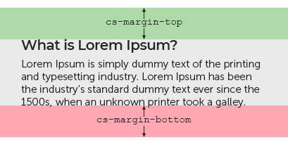
How to use:
<div class="cs-margin-top cs-margin-bottom">
    <h2>What is Lorem Ipsum?</h2>
    <p>Lorem Ipsum is simply dummy text of the printing and typesetting industry.</p>
</div>
Grids
Two columns
Lorem Ipsum is simply dummy text of the printing and typesetting industry. Lorem Ipsum has been the industry's standard dummy text ever since the 1500s, when an unknown printer took a galley of type and scrambled it to make a type specimen book. It has survived not only five centuries, but also the leap into electronic typesetting, remaining essentially unchanged.
It is a long established fact that a reader will be distracted by the readable content of a page when looking at its layout. The point of using Lorem Ipsum is that it has a more-or-less normal distribution of letters, as opposed to using 'Content here, content here', making it look like readable English. Many desktop publishing packages.
How to use:
<div class="row">
    <div class="col-md-6">
        <p>Lorem Ipsum is simply dummy text of the printing and typesetting industry. Lorem Ipsum has been the industry's standard dummy text ever since the 1500s, when an unknown printer took a galley of type and scrambled it to make a type specimen book. It has survived not only five centuries, but also the leap into electronic typesetting, remaining essentially unchanged.</p>
    </div>
    <div class="col-md-6">
        <p>It is a long established fact that a reader will be distracted by the readable content of a page when looking at its layout. The point of using Lorem Ipsum is that it has a more-or-less normal distribution of letters, as opposed to using 'Content here, content here', making it look like readable English. Many desktop publishing packages.</p>
    </div>
</div>
Three columns
Lorem Ipsum is simply dummy text of the printing and typesetting industry. Lorem Ipsum has been the industry's standard dummy text ever since the 1500s, when an unknown printer took a galley of type and scrambled it to make a type specimen book. It has survived not only five centuries, but also the leap into electronic typesetting, remaining essentially unchanged.
It is a long established fact that a reader will be distracted by the readable content of a page when looking at its layout. The point of using Lorem Ipsum is that it has a more-or-less normal distribution of letters, as opposed to using 'Content here, content here', making it look like readable English. Many desktop publishing packages.
Contrary to popular belief, Lorem Ipsum is not simply random text. It has roots in a piece of classical Latin literature from 45 BC, making it over 2000 years old. Richard McClintock, a Latin professor at Hampden-Sydney College in Virginia, looked up one of the more obscure Latin words consectetur, from a Lorem Ipsum passage.
How to use:
<div class="row">
    <div class="col-md-4">
        <p>Lorem Ipsum is simply dummy text of the printing and typesetting industry. Lorem Ipsum has been the industry's standard dummy text ever since the 1500s, when an unknown printer took a galley of type and scrambled it to make a type specimen book. It has survived not only five centuries, but also the leap into electronic typesetting, remaining essentially unchanged.</p>
    </div>
    <div class="col-md-4">
        <p>It is a long established fact that a reader will be distracted by the readable content of a page when looking at its layout. The point of using Lorem Ipsum is that it has a more-or-less normal distribution of letters, as opposed to using 'Content here, content here', making it look like readable English. Many desktop publishing packages.</p>
    </div>
    <div class="col-md-4">
        <p>Contrary to popular belief, Lorem Ipsum is not simply random text. It has roots in a piece of classical Latin literature from 45 BC, making it over 2000 years old. Richard McClintock, a Latin professor at Hampden-Sydney College in Virginia, looked up one of the more obscure Latin words consectetur, from a Lorem Ipsum passage.</p>
    </div>
</div>
Four columns
Lorem Ipsum is simply dummy text of the printing and typesetting industry.
It is a long established fact that a reader will be distracted .
Contrary to popular belief, Lorem Ipsum is not simply random text.
There are many variations of passages of Lorem Ipsum available.
How to use:
<div class="row">
    <div class="col-md-3">
        <p>Lorem Ipsum is simply dummy text of the printing and typesetting industry.</p>
    </div>
    <div class="col-md-3">
        <p>It is a long established fact that a reader will be distracted .</p>
    </div>
    <div class="col-md-3">
        <p>Contrary to popular belief, Lorem Ipsum is not simply random text.</p>
    </div>
    <div class="col-md-3">
        <p>There are many variations of passages of Lorem Ipsum available.</p>
    </div>
</div>